Compare temporal coverage across conflict/campaign datasets
Source:R/plot_dataset_comparison.R
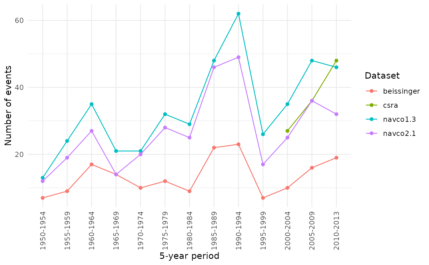
plot_temporal_coverage.RdDraws a line chart of the number of events per time period for any set
of conflict_data() campaign or episode datasets, in the style of
Guseinov, Ustyuzhanin, and Korotayev (2026), Figures 4-5. Comparing
several datasets this way shows whether they track the same broad
historical trends, and where one dataset picks up a surge or lull that
the others miss.
Usage
plot_temporal_coverage(
  datasets,
  start_year,
  end_year,
  coding_system = c("cow", "gw"),
  period_length = 5,
  by_region = FALSE
)
Source
Guseinov, R., Ustyuzhanin, V., & Korotayev, A. (2026). Talking about the [same] revolution? A comparative analysis of main datasets of revolutionary events. Defence and Peace Economics, 1–31. doi:10.1080/10242694.2026.2704178
Arguments
- datasets
Character vector of
conflict_data()dataset keys to compare, e.g.c("navco1.3", "beissinger", "csra").- start_year, end_year
Integer. Year range to compare (applied to every dataset).
- coding_system
"cow"or"gw".- period_length
Integer. Width in years of each time bin (default
5, matching the source article).- by_region
Logical. If
TRUE, facet by World Bank region (one panel per region, as in Figure 4). IfFALSE(default), a single global panel (as in Figure 5).
References
Guseinov, R., Ustyuzhanin, V., & Korotayev, A. (2026). Talking about the [same] revolution? A comparative analysis of main datasets of revolutionary events. Defence and Peace Economics, 1-31. doi:10.1080/10242694.2026.2704178
Examples
if (requireNamespace("ggplot2", quietly = TRUE)) {
  plot_temporal_coverage(
    c("navco1.3", "navco2.1", "beissinger", "csra"),
    start_year = 1950, end_year = 2013
  )
}